
In much of Pakistan, the nearest hospital or clinic is a long walk away. Maps of access from 2019–20 estimate that half the population faces a walk of roughly 77 minutes or longer. The average walking time is just over two hours, reflecting much longer journeys in some areas. The next question is how those journeys relate to care: where women give birth and what can be said about newborn survival.
What the maps measure
The Malaria Atlas Project estimates the fastest route to a mapped hospital or clinic, using roads, terrain and land cover. One version assumes the entire journey is made on foot. The other assumes access to motorised transport wherever the route allows it.
These are two assumptions about transport, not limits on the time a real journey can take. A patient may walk to a road, wait for a bus or rickshaw, and then travel further because the nearest clinic cannot provide the care they need. Neither map shows whether a facility is open, staffed, affordable or equipped for childbirth.
Owning a vehicle is also different from being able to find a ride. In Punjab's 2017–18 household survey, about a third of households owned no motorcycle, scooter, car, truck or van. In Khyber Pakhtunkhwa's 2019 survey, the share was nearly two-thirds. These households may use hired or public transport, but ownership data do not tell us whether transport is available when it is needed.
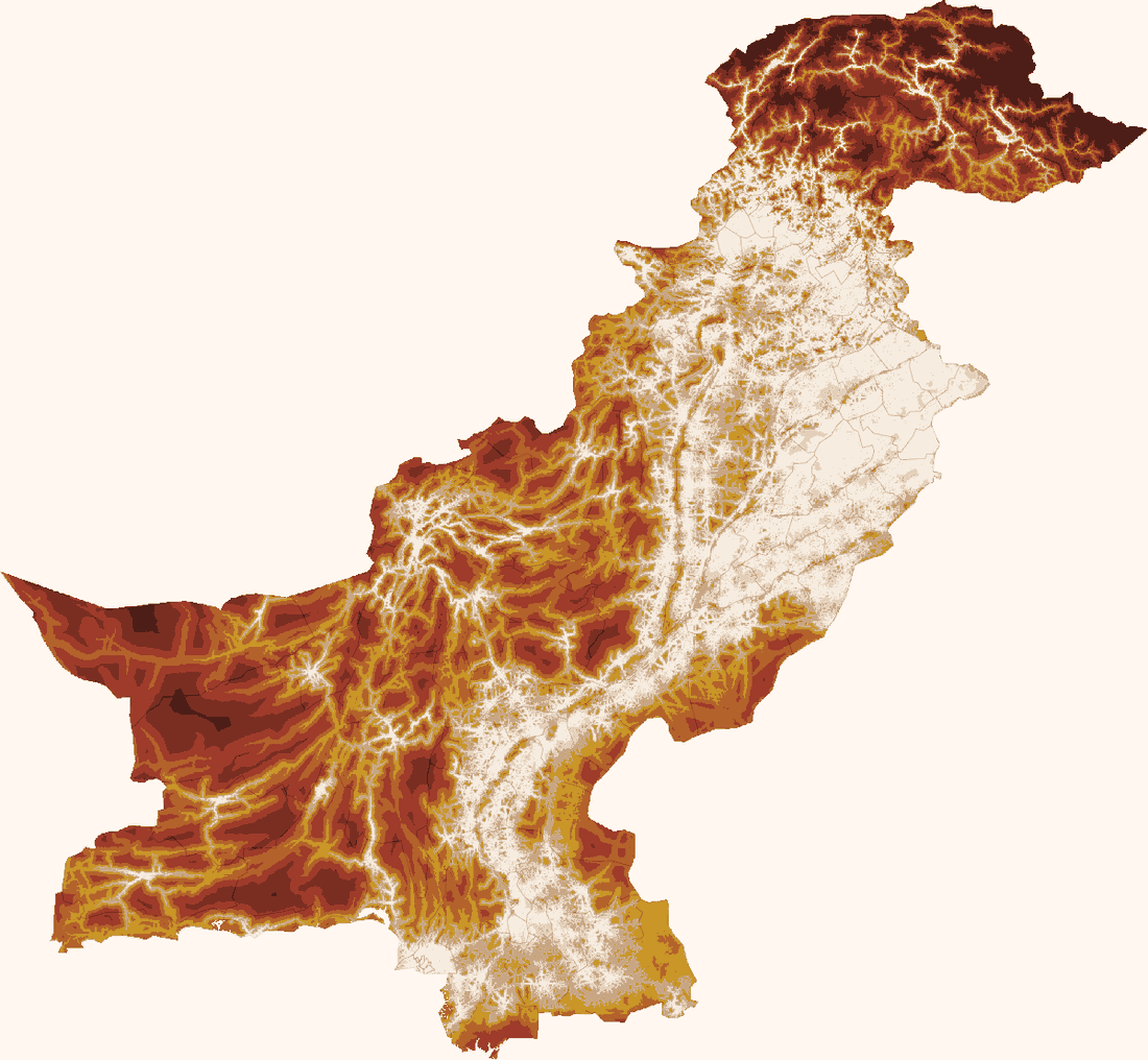
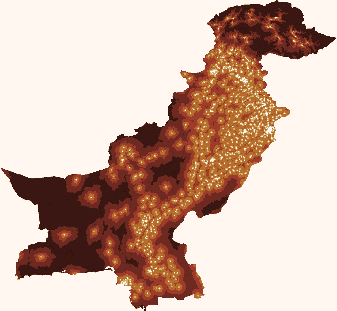
Where the longest journeys fall
Motorised transport shortens the estimated journey considerably: the median falls to about eight minutes and the average to 22 minutes. Yet access remains uneven. Using 2020 population estimates, Adaad calculates that 16.4mn people live more than an hour from the nearest mapped facility even with motorised transport. Of those, 6.7mn are more than two hours away.
In the motorised scenario, Gilgit-Baltistan has the largest share of people beyond an hour away (about two-thirds). But the largest number is in Khyber Pakhtunkhwa. Including the ex-FATA merged districts, 5.4mn people there live more than an hour from a mapped facility. Balochistan follows with 4.1mn, Sindh with 3mn and Punjab with 2.6mn.
Tharparkar has the largest district total: about 790,000 people, or 54 per cent of its population. In the Kohistan area covered by the map's district boundaries, the figure is about 630,000 or 77 per cent. Both are among the poorest areas covered by the household poverty data, and they are not exceptions. Across the districts the poverty data reach, longer journeys and deeper deprivation sit in the same places.
The wider poverty pattern is clear. Adaad ranked districts by a measure of deprivation in education, health and living standards, then divided the population covered by those data into five roughly equal groups. In the group living in the least-poor districts, the average journey is five minutes with motorised transport and 45 minutes on foot. In the group living in the poorest districts, it is 47 minutes and just over four hours.
These groups describe the poverty of the area where people live, rather than each family's income. They show that long journeys and wider deprivation often occur in the same places.
How we examined the links to care and survival
The maps show where journeys are long. To examine how that geography relates to care and survival, Adaad combined four provincial Multiple Indicator Cluster Surveys conducted between 2017 and 2020. The surveys record birth histories and delivery locations. They allow comparisons between households; they do not follow what happens when a new road, transport service or facility opens.
The surveys do not provide household coordinates, so the link to the maps has to work at a broader scale. Each record receives the average walking time for its district's urban or rural area. The map defines urban areas using a density threshold of 1,500 people per square kilometre, which has not been validated against the survey's urban classification. The assigned time therefore describes access in the surrounding area, not the journey made by that family.
The main comparison is within each district. A method called district fixed effects removes average differences between districts, such as their overall remoteness or service provision. Every household in a district's urban group receives the same travel time, as does every household in its rural group. The models ask whether the urban–rural differences in care or survival are wider where the differences in travel time are larger, after adjustment. Towns and villages may also differ in unmeasured ways, including service quality and transport availability, which can still influence the results.
The models use the survey weights and allow for similarities among respondents from the same sampling area when calculating uncertainty. Combining the provincial weights does not make the results nationally representative: the weights have not been adjusted to reflect provinces' shares of Pakistan's population. The findings describe associations in the combined surveys. The 95 per cent confidence intervals reported below show sampling uncertainty under the models' assumptions; they do not cover all uncertainty from the travel estimates or unmeasured differences between households.
Longer journeys are linked to fewer facility births
Facility births are less common where the assigned walk to care is longer. In the model, an approximate doubling of walking time is associated with a share of births in a facility 2.1 percentage points lower, with a 95 per cent confidence interval from 1.0 to 3.2 points lower. The comparison covers 36,188 births clearly recorded as taking place at home or in a facility, each woman's most recent birth in the preceding two years. It is a reasonably clear association within this model, although it does not predict what a transport programme would achieve.
The comparison allows for measured differences between the women giving birth: household wealth, the mother's education and age at birth, the child's sex, birth order and the interval since the previous birth, as well as district differences. This reduces the chance that those factors alone explain the travel association. Differences the survey does not measure, and errors in assigning area travel times, can still affect it.
A simpler comparison of towns and villages points in the same direction. Across 90 districts, Adaad compared each district's urban and rural areas, then split the districts into two equal groups by the difference in their average walking times. In the 45 districts with smaller walking-time differences, rural women deliver in a facility about six percentage points less often than urban women. In the 45 with larger differences, the gap widens to 17 points. These are plain averages, one per district, without the household adjustments used above. They support the pattern but do not measure what changing travel time would do.
The journey is only one part of getting care. These findings are consistent with distance being a barrier to facility delivery, but for many households other barriers may be larger. Families must meet the fare, fees, medicine costs and the cost of work lost. These travel estimates do not capture the financial barriers to reaching a facility. Nor does the distinction between home and facility capture all the care a woman receives: a home birth may be attended by a trained health worker, while reaching a facility does not establish that care is timely or appropriate.
A less certain link to newborn survival
Newborn survival is harder to pin down. The main analysis covers 291,600 births recorded between one and 179 calendar months before interview and measures death in the first month of life. It compares births within districts, with the same household and birth-risk controls used in the delivery model.
Across that full birth history, the association is small and uncertain. An approximate doubling of assigned walking time is associated with 0.54 additional deaths per 1,000 births; the 95 per cent confidence interval runs from 0.59 fewer to 1.66 more. The result is compatible with a small reduction, no difference or an increase in mortality. More detailed adjustment for wealth, education, birth order and urban or rural location leaves that reading intact; the estimates are reported in the method note. Household income, the mother's literacy and her health before pregnancy remain unmeasured.
The scale of the geographical comparison matters too. Comparing within provinces, with the same measured household and birth-risk controls, gives about one additional death per 1,000 for a doubling of walking time, with a confidence interval excluding zero. Comparing within districts reduces the estimate and makes it less precise. The broader comparison can capture other differences between districts alongside travel time.
There is also a timing problem. The birth histories reach back almost fifteen years, while the travel map describes access around 2019–20. Roads and facilities may have changed, families may have moved, and household wealth is measured at interview rather than at the time of each birth. These mismatches can obscure or distort a relationship. The larger sample cannot by itself overcome them.
The timing concern makes recent births particularly relevant. Restricting the analysis to all 39,854 eligible births in the preceding one to 24 months gives a larger estimate: 2.16 additional deaths per 1,000 for a doubling of assigned walking time. Its confidence interval ranges from 0.10 fewer to 4.41 more deaths. The direction remains uncertain at the conventional 95 per cent level, but the interval includes increases that could matter for policy. Excluding births less than two calendar months before interview leaves a similar result.
Selecting only each woman's most recent birth within that two-year window, as required for the delivery-location analysis, gives 36,429 births and an estimate of about 3.1 additional deaths per 1,000 for an approximate doubling of assigned walking time. The confidence interval runs from 0.9 to 5.3 more deaths, excluding zero. But selecting the latest birth can leave out earlier deaths: a mother who loses a baby may have another child sooner. This makes the restricted sample a potentially biased basis for judging newborn survival.
The recent-birth estimates are therefore an important qualification to the full-history result. They do not establish that the recent association is causal, or that the older data necessarily understate it. Several birth windows were examined, and changing a sample changes both its precision and its composition. Taken together, the results do not provide a stable estimate of how many newborn lives shorter journeys would save.
Why delivery location does not settle the survival question
Comparing home and facility births leaves the survival question open. Among the same 36,188 recent births with a clearly recorded location, and after adjustment for measured risks and travel time, the estimated difference is about 0.8 more deaths per 1,000 among facility births. The confidence interval runs from roughly 3.5 fewer to 5.0 more. This is too uncertain to establish a difference, and it cannot be read as evidence that facilities offer no protection.
A difficult labour may be referred to a hospital, while a straightforward birth stays at home. The surveys do not record enough about complications, referral delays or the care provided to separate the benefit of a facility from the risks of the patients who reach it. Restricting the comparison to each woman's latest birth adds the selection problem described above. Without a credible estimate of the facility's survival benefit, the delivery and mortality associations cannot be combined into a reliable estimate of deaths preventable through shorter journeys.
The larger birth-history sample does identify associations with other risks. Births less than two years after a previous birth are associated with about 25 additional first-month deaths per 1,000 compared with births spaced at least two years apart, after adjustment. First births and births to young mothers also carry higher recorded risks. These findings support attention to care before and during pregnancy as well as delivery. Comparing these coefficients with the travel-time coefficient does not rank interventions by their likely benefit.
What this means for policy
The strongest geographical finding is the concentration of long modelled journeys among millions of people, especially in poorer areas. The large numbers beyond an hour in KP, Balochistan and Sindh identify places for closer investigation. Before using the urban–rural comparisons to target services, the map's population-density classification should be checked against survey geography and local knowledge.
The delivery findings support investigating transport barriers alongside household resources. Planning should examine the journey, the family's ability to obtain care, and the services available on arrival.
Choosing a response requires local information: whether the nearest facility offers the service needed, whether staff and supplies are available, how patients reach it and how referrals work. A transport service, an upgraded facility and a new facility address different problems. Their effects should be assessed using actual journeys, service use and care quality, with a comparison that can distinguish the programme's contribution from other changes.
Unequal access deserves attention even while its effect on newborn mortality remains uncertain. The evidence supports action to understand and reduce barriers to care. It does not yet support a precise claim about how many newborn lives shorter journeys would save.
Travel and population. Malaria Atlas Project layers estimate travel to mapped hospitals and clinics at approximately one-kilometre resolution: motorised 2019 and walking-only 2020. Weighting by WorldPop 2020 covers 220.1mn people on valid pixels. Counts reflect these historical estimates and the supplied district boundaries; the ex-FATA merged districts are counted within Khyber Pakhtunkhwa throughout, and flagged as merged districts in the downloadable files. Facility omissions, road changes and population-estimate errors affect headcounts and population-weighted shares.
District poverty. Data Darbar's index uses the Alkire–Foster method and PSLM 2019–20. Its 119 poverty units map to 125 areas because seven Karachi subdivisions share one estimate. Population groups cover 214.5mn people, excluding AJK, Gilgit-Baltistan and five Balochistan districts. Whole-district allocation by cumulative population makes their sizes approximate. This area index is separate from household wealth.
Survey coverage and weights. MICS rounds: Punjab 2017–18, Sindh 2018–19, KP 2019 and Balochistan 2019–20. Of 129 survey districts, 128 join the travel data. Vehicle figures use household weights and valid responses. Outcome models retain provincial survey weights without national population calibration. Wealth indicators compare the lowest two and highest two survey-specific fifths with the middle fifth.
Travel exposure and estimation. Each record receives the population-weighted mean walking time for its district's urban or rural area; the urban map threshold is 1,500 people per square kilometre. Weighted linear probability models estimate how the chance of an outcome varies with travel time and the other included factors. They add one minute to each walking-time estimate and use the natural logarithm of the result. Multiplying the travel coefficient by the natural logarithm of two gives the reported approximate-doubling comparison: for example, 30 minutes becomes 61 minutes, rather than exactly 60. The extra minute follows from adding one before taking the logarithm; the approximation becomes closer as journeys get longer. District fixed effects compare records after subtracting the survey-weighted district averages. The 95 per cent confidence intervals are the estimate plus or minus 1.96 standard errors. Standard errors allow for similarities within survey sampling units, using province-specific identifiers. They do not capture all error shared by records assigned the same area travel time.
Delivery and birth-risk controls. The delivery and facility/home models use 36,188 most recent births 1–24 calendar months before interview, excluding 168 other-location and 73 no-response records; there are 5,671 sampling-unit clusters. Delivery and mortality controls are wealth indicators, plus indicators for no maternal education, female child, first birth, fourth or later birth, spacing below two years, and maternal age below 20 or at least 35. Figure 6 uses unadjusted, equally weighted averages across 90 district pairs.
Mortality definitions and sensitivity. The main sample has 291,600 births and 5,754 sampling-unit clusters. Finer controls (five wealth fifths, four education levels, every birth order) give +0.20 deaths per 1,000 per doubling, 95 per cent interval −0.93 to +1.33; adding an urban/rural indicator gives +0.49, interval −1.14 to +2.13. The recent all-birth and most-recent-birth samples have 39,854 and 36,429 births respectively; neither requires a specified delivery location. Imputed age at death under one month covers 0–29 days, rather than the standard neonatal 0–27. Calendar month windows do not ensure a completed first month. Restricting to 2–24 months gives n = 37,986, +2.23 deaths per 1,000 per doubling, and a 95 per cent interval of −0.13 to +4.59. The explored time windows are sensitivity checks, not independent confirmations.
Sources and analysis files. Weiss et al., Global maps of travel time to healthcare facilities, Nature Medicine 26 (2020), doi:10.1038/s41591-020-1059-1; WorldPop 2020; provincial MICS; PSLM 2019–20; Data Darbar. Corrected delivery-location calculations are documented in Adaad's accompanying analysis and review files.
Sameen Siddiqi is a professor in the Department of Community Health Sciences at Aga Khan University, Karachi, where he was previously chair. He spent sixteen years at the World Health Organization, including as Director of Health System Development at its Eastern Mediterranean regional office and as WHO Representative to Lebanon and to Iran, and has advised governments across the region on universal health coverage and health system reform. He co-chairs Pakistan’s National Advisory Committee on Health, led the development of the country’s Health and Population Policy 2026–2035, and is lead editor of Making Health Systems Work in Low- and Middle-Income Countries (Cambridge University Press). AKU profile.